I’ve been trying to pull together for some time why I like certain types of art. I enjoy fine art, but I also enjoy some illustration and graphic design because of its simplicity.
For example, I like the expressiveness of a Jackson Pollock, but I also like Greek Vases, the works of Scot Flanders, more recently, Richard Hambleton’s Shadowman. Included also are ink paintings of China and Japan.
I’m looking for my style or niche like any artist, and the question to myself is why I like such different art styles? How do I find my style that reflects the art I like?
One eureka moment hit me when I looked at photography and picked up the Contra Jour style. Which is French for ‘Against the day‘.
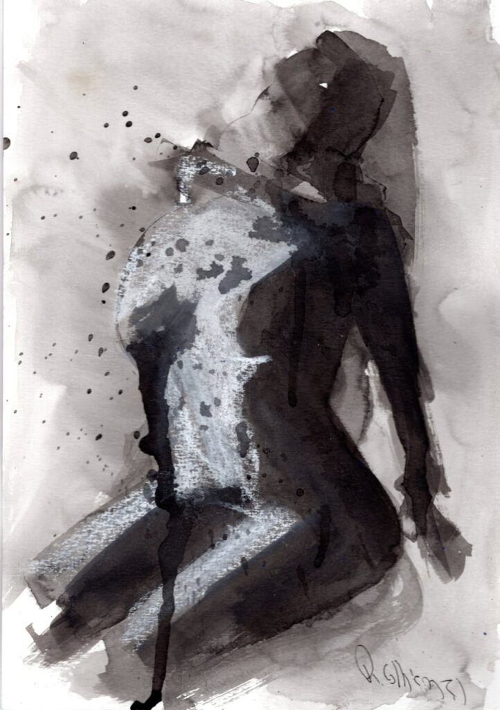
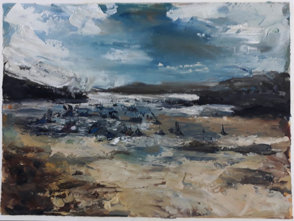
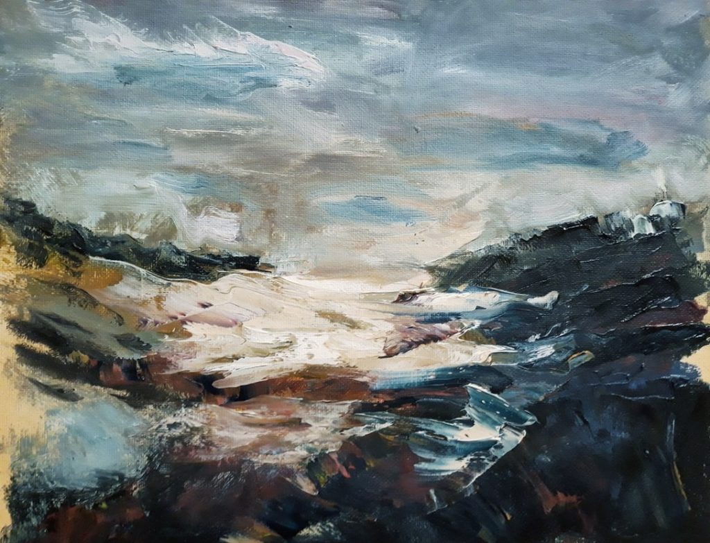
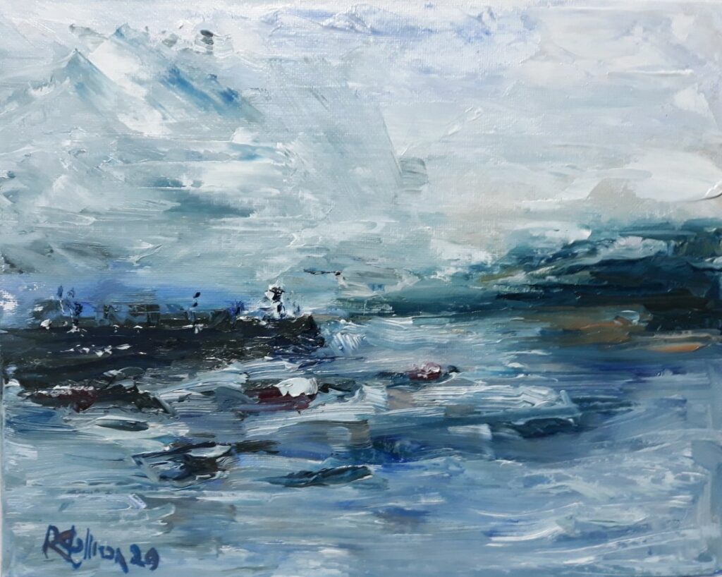
The backlight creates solid shadows and silhouettes, which I noted look like the simplicity of graphic design, ink paintings, and more. Such intense light simplifies the tones, and the colours make it more like a graphical presentation.
The effect is strong or weak, with stronger tonal contrast or more colour. Its shows I like art with a clear, tonal value plan, a noticeable light and dark. There may be gradations in between, but the contrast has to be there.
Strong contrast creates an intense mood, like a Craavagio, only here the tones are reversed. A strongly lighted subject on a dark background.
Further still, the contra jour silhouettes can be used as an armature. It can be black and white like a notan or shades of grey. But colour can also be added, like a Yves Klien Anthropometry. It’s also the lighting typical of a sunset, which is always popular.
The simplicity of the contra jour effect and graphic design are styles of art that seem to matter to me.
Artists are looking for a voice, and in looking through lots of art, trends and patterns become apparent. Such patterns, I feel, can inform our art practice and help point us in the right direction to create the art we enjoy making.

Star Wars 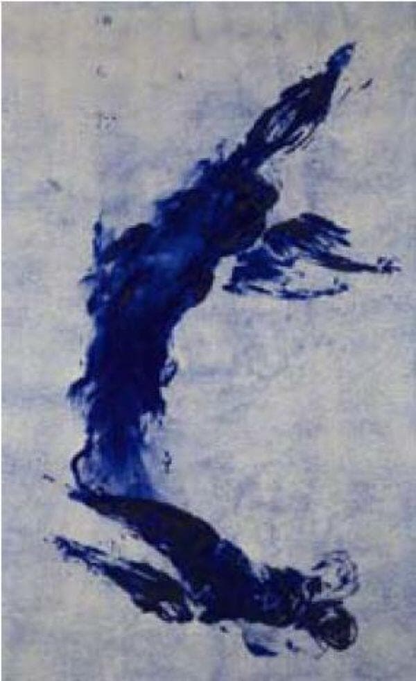
Yves Klien 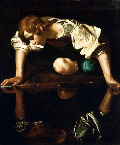
Caravaggio 
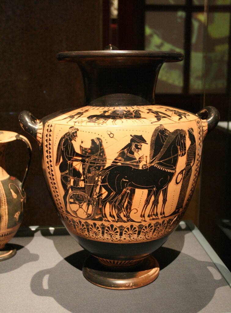
Greek Vases 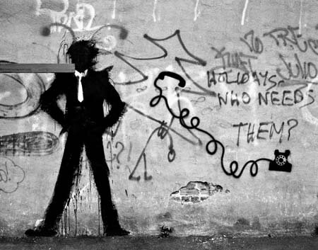
Shadowman by Hambleton 
Scott Flanders
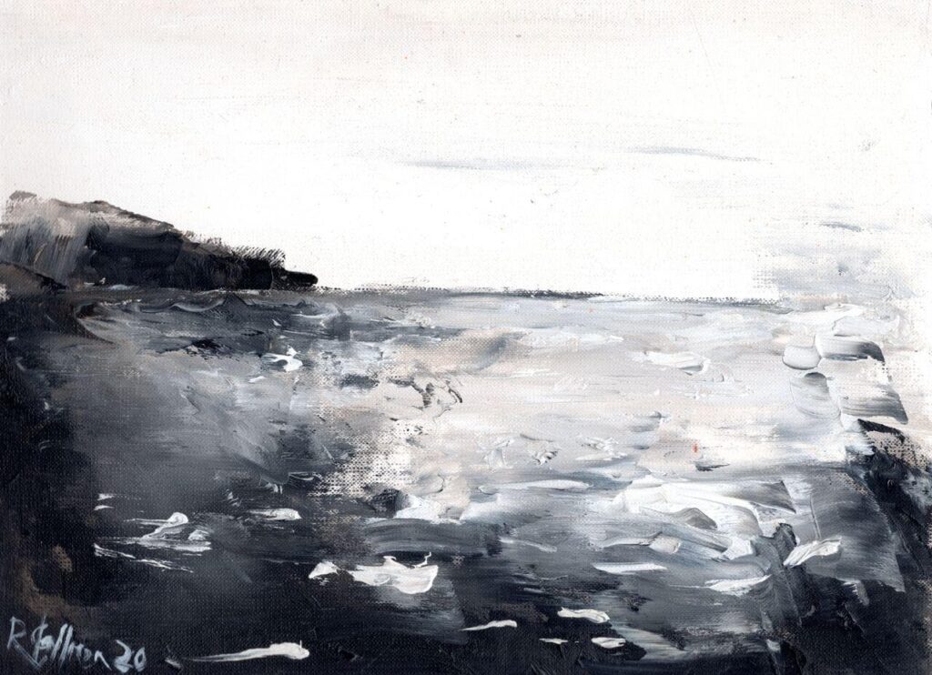
Some of My own Include